 🔍 Browse
🔍 Browse
🔍 Browse
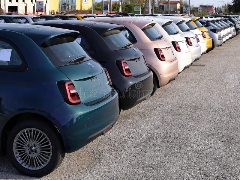
Bold two-tone colour combinations with matching dashboard panels. Body-coloured door mirrors and bright interior accents. The most visually playful 500 ever made.
Source This Edition ❯In 2013, Fiat departed from the luxury brand collaborations that had defined previous special editions, instead introducing the Colour Therapy—a celebration of bold, joyful colour combinations grounded in genuine design thinking about colour psychology. This edition wasn't about fashion-house prestige or heritage storytelling; instead, it was about using vibrant colour combinations to express personality and psychological wellbeing.
The concept was thoughtfully developed. Colour psychology research demonstrates that bold, intentional colour pairings can positively influence mood and perception. Fiat translated this into automotive form, creating multiple distinct colour schemes featuring contrasting body and roof treatments, body-coloured door mirrors for visual cohesion, and interior treatments that extended the colour story into the cabin space. The Colour Therapy was the most visually playful 500 ever produced, yet executed with sophisticated colour theory rather than random visual chaos.
What distinguished the Colour Therapy from simple paint option variations was the coordinated interior approach. Matching dashboard panels, colour-coordinated trim, and bright interior accents meant that stepping inside the 500 revealed a complete colour vision rather than standard grey monotone. This holistic approach to colour extended far beyond typical automotive trim specifications.
Production spanned 2013 through 2015, with multiple colour combination options available throughout the period. Unlike limited special editions with single-year availability, the Colour Therapy's extended production and colour options mean that surviving examples are more abundant than earlier designer collaborations. However, the psychologically-motivated design approach and sophisticated colour execution have attracted growing collector interest as design historians recognise the edition's significant contribution to 500 special edition thinking.
The Colour Therapy's design philosophy hinged entirely on colour. Rather than creating new body shapes or mechanical refinements, Fiat focused exclusively on how carefully-chosen colour combinations could transform the 500's visual presence. The execution demonstrated remarkable sophistication in colour theory application—these weren't random bright colours, but carefully-considered palettes that complemented each other while creating visual vibrancy.
The signature design element was the two-tone treatment: a primary body colour paired with a complementary roof colour. Rather than this feeling visually chaotic, the colour combinations were studied to create harmonious contrast. Popular combinations included pearlescent white bodies with green roofs, apple-green bodies with white roofs, orange bodies with grey roofs, and other sophisticated pairings. Each combination was named and presented as a distinct design proposition rather than just a paint option.
Body-coloured door mirrors extended the primary body colour detail upward, creating visual cohesion and emphasising the 500's compact dimensions. Rather than chrome or black plastic mirrors, the Colour Therapy ensured that the colour story continued uninterrupted across the entire vehicle silhouette. This attention to detail—ensuring that every panel participated in the colour vision—elevated the specification from casual customisation into deliberate design orchestration.
The roof treatment was equally considered. On open-top cabriolets, the fabric roof could be specified in matching colours, maintaining the two-tone vision even with the top down. The contrast between body and roof colour created visual interest without visual aggression—contemporary colour theory informed every decision.
Alloy wheels were finished in coordinating metallic silver or body-matched colours, depending on the colour scheme chosen. Chrome detailing was minimal, allowing the colour combinations to command attention without competing visual elements. This restraint in badging and secondary detailing ensured that the colour story remained the primary design focus.
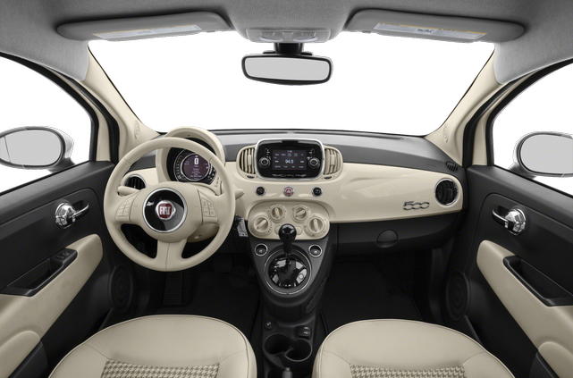
The Colour Therapy's most distinctive feature was how deliberately it extended the colour story from exterior into interior space. Where standard 500s featured neutral grey or black dashboards, Colour Therapy models offered dashboards finished in colours that coordinated with the exterior treatment. This was far more sophisticated than superficial decoration—it represented genuine understanding that the colour psychology effect required environmental immersion rather than external-only impact.
Matching dashboard trim in colours coordinating with the exterior colour scheme created seamless visual continuity. Stepping into a Colour Therapy 500 meant immersion in the complete colour vision—the exterior colours extended into the cabin through dashboard treatment, trim accents, and seat upholstery patterns. This comprehensive approach made the Colour Therapy feel less like a car with paint options and more like a complete design environment.
Bright interior accents further reinforced the colour vision. Seat fabrics featured complementary colour elements, steering wheel trim could be colour-coordinated, and door panel inserts participated in the overall colour scheme. Where luxury special editions had focused on material quality (leather, wood trim), the Colour Therapy instead invested in sophisticated colour orchestration that required genuine design thinking to execute successfully.
Climate control and modern connectivity features functioned within the colour-coordinated cabin environment. The 500's inherent compactness meant that the complete colour environment was visible and experienced constantly—passengers literally surrounded themselves with the psychological benefits of the chosen colour combination.
The Colour Therapy was offered with two engine options, both aligned with the edition's philosophy of joyful, accessible driving rather than performance aggression. Engine selection didn't affect the colour treatment—whether choosing the economical or sporty option, you maintained the full colour vision specified.
The 1.2-litre 69 hp engine: This naturally aspirated four-cylinder produces 102 Nm of torque. Fiat's published standard-engine figures are 0–62 mph in 12.9 seconds and a 99 mph maximum speed. Actual economy depends on condition and use.
The 1.4-litre 100 hp engine: Where this engine applies, Fiat's standard figures are 131 Nm at 4,250 rpm, 0–62 mph in 10.5 seconds and a 113 mph maximum speed. Verify engine availability from the exact Colour Therapy registration and market.
Both engines were paired with smooth five-speed manual transmissions as standard. The pairing with the colour-therapy philosophy created an interesting contrast—bold, joyful visual expression combined with accessible, practical mechanical simplicity. This made the Colour Therapy appealing to younger buyers wanting visual distinctiveness without excessive performance requirements.
The Colour Therapy edition was built on genuine colour psychology research demonstrating how colour combinations influence mood, perception, and emotional wellbeing. Rather than applying colours arbitrarily, Fiat collaborated with colour science experts to ensure that each pairing worked harmoniously.
The psychological principles were straightforward yet powerful: complementary colour combinations create visual harmony, saturated colours improve mood, and colour diversity prevents visual monotony. By coordinating exterior and interior colours, the Colour Therapy created a complete environmental immersion that maximised these psychological benefits.
This was a sophisticated design approach that transcended typical automotive thinking. Rather than chasing performance metrics or luxury materials, the Colour Therapy recognised that daily driving experience is profoundly influenced by the visual environment. The joyful colours communicated optimism and wellbeing with every drive—a psychological benefit that standard-coloured vehicles couldn't provide.
Owning a Colour Therapy is a different experience from standard 500 ownership. The bold exterior colours attract constant attention—in urban environments this is celebrated, on motorways it can feel exposed. Buyers need genuine confidence in their colour choices and willingness to maintain the distinctive visual presentation.
The colour-coordinated interior requires diligent maintenance. Dashboard and trim colours are vulnerable to sun fading—window shades and regular interior protection treatments are sensible investments. Professional detailing twice annually helps preserve the colour vibrancy. Spills or marks are visible against bright dashboard colours, making careful interior use important.
Mechanically, the 500 is straightforward. Both engine options are reliable when properly maintained. Parts availability is excellent for mechanical components; only colour-matched trim presents sourcing challenges. Insurance costs are typically moderate and aligned with equivalent standard 500s—the colours don't affect underwriting.
Practicality is standard for a 500—this is an urban, short-journey vehicle with modest boot space and tight rear seating. The psychological benefits of the colour environment don't change these functional limitations, but they do make daily urban driving more emotionally rewarding.
The Colour Therapy is best suited to buyers who genuinely love colour, appreciate design innovation, and commit to preserving both exterior paint and interior colour vibrancy. These owners find that their Colour Therapy 500 creates a daily mood benefit that transcends typical car ownership experience.
Finding a quality Colour Therapy requires attention to colour condition and interior preservation. The extensive production and multiple colour options mean that available examples are relatively abundant, but finding one with pristine colour-coordination throughout is more challenging.
Exterior Paint Assessment: Inspect the two-tone colour treatment carefully. Both body and roof colours should be equally vibrant—any significant sun fading indicates years of outdoor exposure. The roof colour is particularly vulnerable to UV damage. Colour-coordinated door mirrors should match the body colour exactly. Any repainting eliminates the edition's design philosophy.
Interior Colour Condition: Dashboard and trim colours are critical. Any fading, discolouration, or chalking indicates poor interior protection over ownership years. Run your hand across dashboard surfaces—any rough texture suggests sun damage. The steering wheel and door panel colours should coordinate with the dashboard. Interior colour degradation is difficult and expensive to remedy.
Service History: Comprehensive service history indicates conscientious ownership. Any gaps suggest potential mechanical issues. Well-maintained examples with regular servicing represent better value than lower-mileage examples with poor maintenance.
Colour Rarity: Consider colour combination rarity if investment potential matters. Uncommon combinations may appreciate slightly more than white or silver variants. However, condition matters more than colour rarity—a pristine standard colour is more valuable than a neglected rare combination.
Mechanical Inspection: Have any purchase independently inspected by a 500-specialist mechanic. Verify engine smoothness, gear change quality, and electrical functionality. Suspension should feel tight without rattles.
At Fiat 500 Frenzy, we maintain an eye on the Colour Therapy market. If you're seeking a specific colour combination or need guidance on finding a well-preserved example, contact us. Our team understands what distinguishes a genuinely special Colour Therapy from a faded, neglected example.
We actively source rare editions. Tell us what you want and we'll hunt it down.
Start Sourcing Request ❯